INTRODUCTION
Chapter 1: Seize the opportunity.
During the Pandemic, book store sales have climbed and reached an eight-year high, despite many bookstores being closed during 2020.
The Alabama Booksmith is a bookstore in Alabama, U.S.A. that sells exclusively signed books on their website and in-store. The Alabama Booksmith has a strong service by offering a niche experience, they are the only bookstore in the world that exclusively sells signed books.
The challenge: improve how users discover books and go through the checkout process online.

DETAILS
Needed: A modern e-commerce experience.
The existing website for The Alabama Booksmith is visually very dated and doesn’t offer a cohesive or logical user experience for people who want to browse or purchase a book.
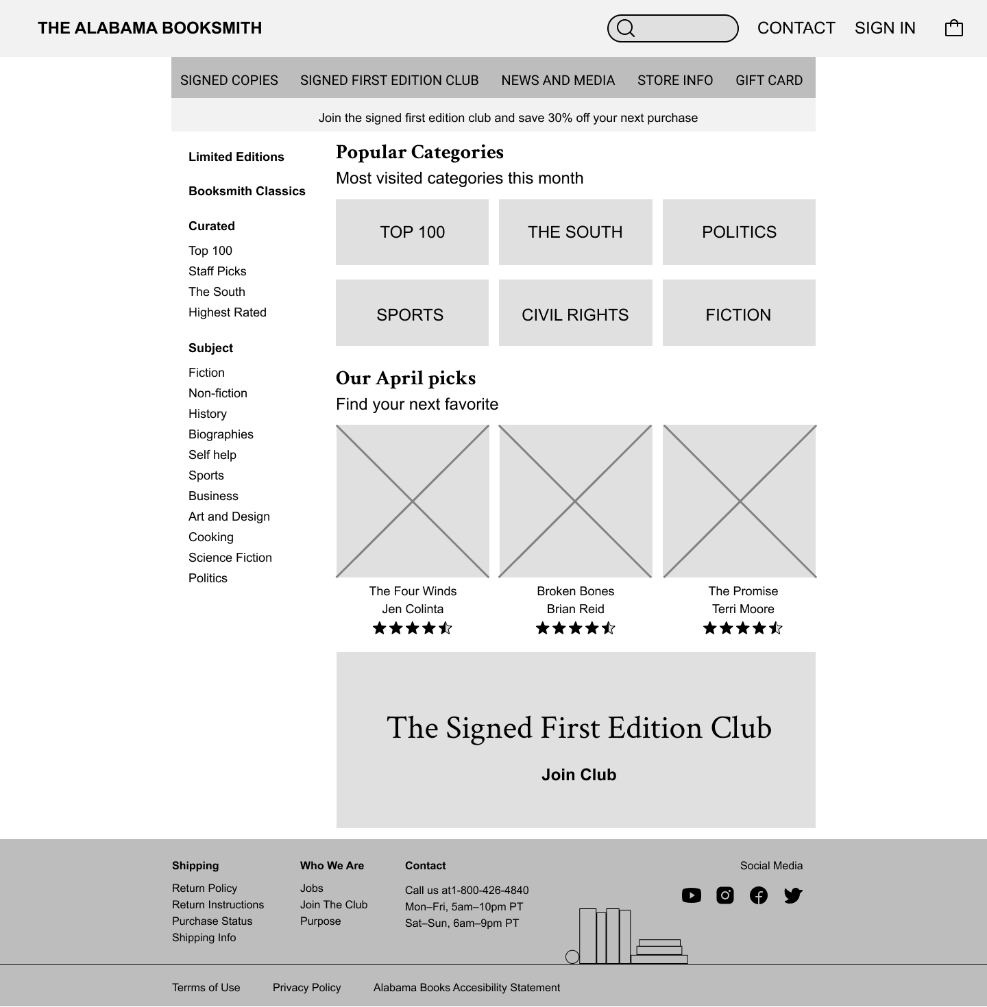
Over the course of a two-week sprint, I conducted in-depth research, sketched low fidelity wireframes, created a mid-fidelity prototype to test, and made a high-fidelity mock-up for a user flow. During this UX journey, I developed the following solutions:
Revised the information architecture to more easily discover books.
Created a whole new user flow from discovering a book to check out.
Improved the checkout process by adding features like a progress bar and form fields to simplify check-out.
PROCESS
Shoppers expect to see more information.
My research began with a comparative and competitive analysis to thoroughly understand the features offered when searching for books and how checkout processes differ.

I then used a proto-persona, The Careful Critic, to assist in focusing my attention on designing the site for a specific demographic.
The Careful Critic:
Takes a long time to purchase items.
Likes to read the reviews.
Compares multiple items before choosing which to purchase.
Likes to write reviews.
This information helped lead me to the following problem statement:

Brad needs a better way to shop online because he finds it difficult to find enough reviews and product information to decide to make a purchase.
How might we create a website that allows people to find all the information they are looking for?
How might we make a website that highlights reviews?
How might we provide product information for shoppers?
IDEATION
It’s not always black and white.
I started by sketching wireframes of the desktop experience. I purposefully made the design modular so that it could easily shift to mobile.
Looking at my early sketches, I had included a call to action for sign-in to purchase instant on the product page. After consulting my comparative and competitive analysis further, I decided the check-out experience shouldn’t reflect Amazon and Powell’s book’s so much. Rather, because The Alabama bookstore is a small and independent bookstore, I felt that their users would find it simpler to checkout as a guest or have the option to sign in at checkout if they were already a member. I discovered in my comparative analysis that Nike and Billabong use a similar method, I believe this is a much more streamlined option for the client.

ITERATION & VALIDATION
Time to check out the checkout process.
I conducted a usability test with four participants, the actionable steps from these sessions were:
66% of my users felt that the checkout process wasn't clear.
25% of my users felt that a label was a button on the mobile checkout.
“What does shipping ground mean, how much will it cost?”
A few of my users mentioned that there wasn’t enough detail on the site to make it feel like a website.

NEXT STEPS
If I had more time.
I want to build labeling and help text for the checkout form.
Build-out view cart functionality.
Integrate signature branding into the mock-up.
WHAT I LEARNED
Show my progress
I learned how important it is to duplicate designs so I can show how my designs evolved throughout the process.


